
Case Study · Aunica
%20(72).png)
Startup
Mental health startup launched in 2024
5
Months
1
UX Researcher & Designer (me)
The context: Aunica is a mental health software startup that helps behavioral health programs implement contingency management, with a focus on increasing client attendance. As the sole UX Researcher & Designer, I developed user personas, managed user testing, and created low, mid, and high-fidelity designs for the full app.
The problem: How can this app help users with their mental health challenges and goals?
The solution: Using consistent user-centered research, I collaborated with the founders and Lead Engineer to develop an intuitive, supportive app that lets users connect with others, post about their progress, log goals and daily check-ins, and chat with an AI-powered chatbot.
The result: Created a 0-to-1 app centering the results of 4 user interviews and 25 survey respondents.
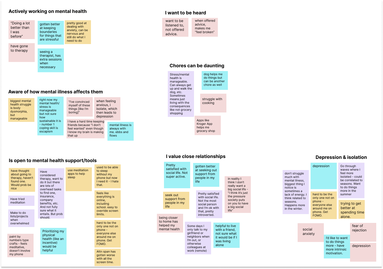
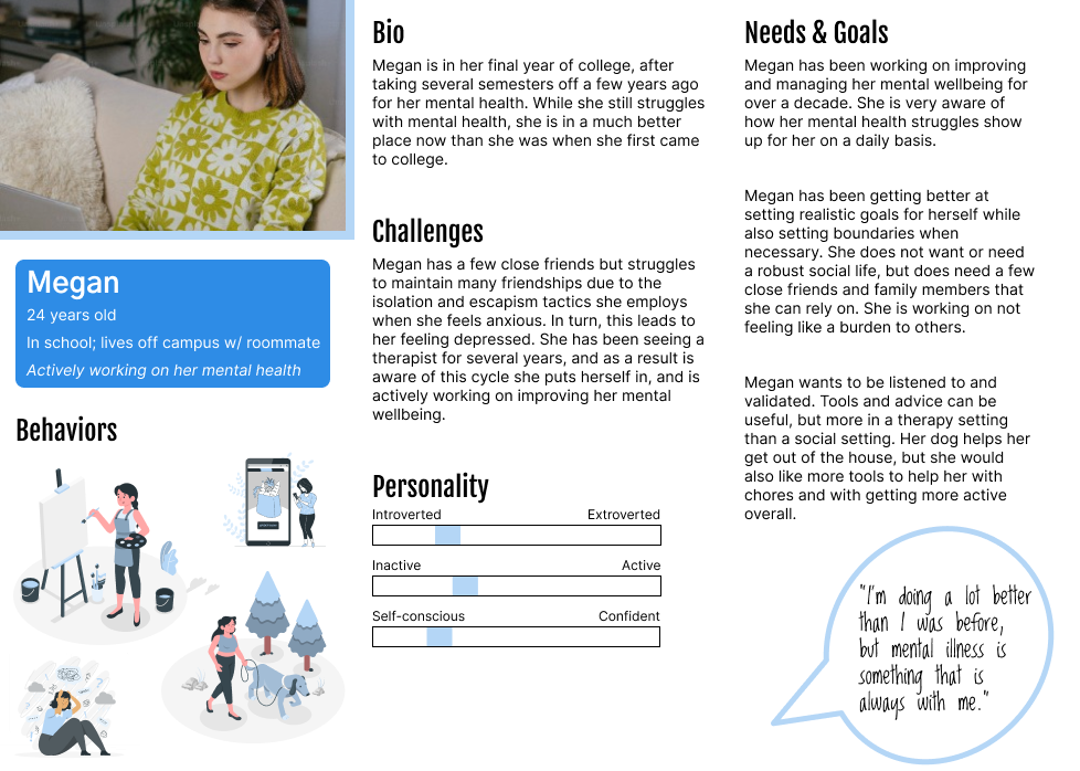
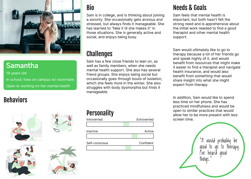
4 user interviews and a behavioral survey of 25 respondents surfaced trends I used to build two personas: users actively working on their mental health, aware of how their challenges affect them, and who value close relationships. Depression and isolation were often tied directly to that value.
problem
Individuals working on their mental health need better access to healthcare tools and best practices.
solution
Design the Aunica app so users can access tools easily and feel connected to a community, supporting their mental health journey.
Using a mobile-first approach, I sketched how the design would work for logged-in and logged-out users, then moved into low-fidelity Figma, centering the research finding that a daily check-in with easy access to goals provides key support for this user base.
%20(91).png)
%20(75).png)
Mid-fidelity introduced color into the component library based on stakeholder feedback. From there, designs moved into high-fidelity prototypes, including Community pages for posting within a group, and a tutorial flow built to feel integrated within the app rather than a separate FAQ.
%20(78).png)
The design below showcases iterations of the Community page, and how it would look to post within a Community page.
%20(73).png)
This user flow below showcases how a new user might experience the app's tutorial. It was intended to feel integrated within the app, so that the new user could visualize where each tool lived. This design allows the user to feel immersed in the app, without having to read a separate FAQ or how-to section.
Much of this design uses placeholder graphics, but it is meant to showcase the intended user flow for a new user.
%20(89).png)
It was important to balance the needs of the stakeholders/founders with the needs of the users. For example, one stakeholder requested he wanted a "Superhero" theme throughout the app. However, I was worried that those colors would be somewhat jarring to users and wouldn't evoke feelings of calm and support that were important to our user personas. Ultimately, it is important to make stakeholders happy but if designs don't solve for user needs, the final product won't be successful. In this instance, I emphasized the needs of the user and tried to find a middle ground - rather than using bright superhero colors, I used variations of those colors that were more muted. This way, I was able to center the user's needs while still validating the stakeholder's request.
Below are a few Figma prototypes showcasing different user flows: Navigating community updates, personalizing your pet, and using the chat feature.
Shipped full low-to-high-fidelity prototypes and user flows for the entire app (community, check-ins, chatbot): built from 4 interviews + a 25-person behavioral survey rather than assumption
Delivered 2 validated user personas that shaped every major flow, including the onboarding tutorial designed to sit inside the app instead of needing a separate help doc
Established a consistent component/color library used across all fidelity stages: gave the founders and engineer a shared design system going into build
Coordinated handoff with developers to confirm designs and flows fit technical scope
Planned future usability testing for accessibility and intuitive flows
Bring asmall round of concept testing (even 3-4 users) to the Superhero branding conversation instead of relying on my own judgment call to find the middle ground would have more firmly validated the decision
Build in a lightweight design-principles doc early, so aesthetic requests from founders have a shared reference point to be evaluated against